Exploiting the visual potential of numbers


For the bar graph, I used different length of rectangular bars to encode the different percentages in each age group. For the pie chart, I used different color of the wedges to encode the different age categories.
The message I want to communicate through this display is the age distribution of yoga practitioners in the US. By showing the percentage of yoga practitioners under each age group, I am hoping the viewers will realize that yoga is a popular sport that is good for all ages.

I used solid rectangular bars with same colors to match the bar chart in my visual language model. For the pie chart, I made the wedges go outside of the white boarder to match the style of the "men VS women" pie chart in the model.

I chose the same dark green color from my model for the bar chart, and used different shades of orange for my pie chart in order to grab different colors for each wedge. However, I realize I only have 3 different shades of orange in my color model, so I had to make up a similar one in my display.
I used large bolded font for the subheading and small thin font for the body, which are the same font styles used in my text model. For the annotations in the charts, I stick to small bolded text that matches the y-axis labels from the charts in my text model.

I designed my display to occupy the bottom left section of my layout model.
Critique
Julie Zhu
In the first version, I see a big title that summarize what this graph is about. I also see small text that gives a bit more background of the graph. I see a horizontal bar graph with x and y axes labeled. In the second version, I see a pie chart for the same data.
I like the second one better because the color coding provides stronger contrast for each section and makes each part more visually obvious. However, I can see the second has some major flaws as it straw away from your visual language and color model. So you may want to revise your the bar chart and make it more closely assigned with your models.
I see that you emulated the orange, blue-greenish color, brown, and red color from your color model. I see that you've emulated the typography and visual language in terms of rectangles and circles. However, each part of the pie chart seems a bit off of the visual language model.
Response to first critique
Julie pointed out that although the pie chart has a stronger color contrast, the different colors of wedges stray away from my visual language model. Since there are 5 different categories if I were to encode each wedge with a different color, and there's not enough available choices from my color model, I chose to revise my bar chart and was able to made it more eye-catching and follows my models better.
Emily Qiao
In the left one, I see a bar chart with blue bars. It shows the age groups of yoga practitioners in us and the proportion. The right one is a pie chart which shows the same information.
I like the left one because it’s easier to tell the difference of each age group. However, It’s hard to read the pie chart because the areas look the same. I think with some styling, you can make the first display more eye-catching and match your visual langue and color models better.
Both displays seems to be following the text model and color model very well. You followed the same bolded style for the annotations and the subheadings from your model. And I can tell your first display fit the section in your layout model pretty well. But the second display may be having a bit more white space. Although, for the first display, there's a lack of orange color. And for the second display, the use of bright colors are too much compared to your color model.
Response to second critique
I took Emily's advice to add more styling to my first display, and was able to make the age labels more eye-catching. She pointed out the first display is lacking the orange color, so I made the text of age groups into orange, which turns out to be a better emulation of my visual language model as well! I agree with Emily's opinion that the pie chart is hard to read and has too much bright colors. So I decided to use the bar chart for my number display.
Chelsea Wang
In the first version, I see a bar chart representing different data for different age groups. I see a title explaining what the chart is about and also some small texts explaining the chart further. In the second version, I saw the title and subtitle as well as the pie chart with different colors. It's also for different age groups. The color of each portion of the pie chart darkens as the number increases.
I prefer the second version better since it has more color variations. In the first version, the percentage on the x-axis is confusing. I'm not sure I understand what that is. It also only has one color which makes it less interesting comparing to the second version. However, I'm not sure pie chart is a good choice to represent your data since your numbers are pretty close and it's hard to see the proportions very well.
I can see you emulated your visual language model pretty well for both of your versions. For the second one, since your visual language model represent the pie chart with a single out line I would suggest you to try that and do different pie charts for each age groups. You clearly emulated your typography model and color model pretty well. The layout also makes sense to me.
Response to third critique
I agree with Chelsea's opinion that pie chart is hard to read given my numbers are very close with each other, so I chose the bar chart to display my numbers. In response to Chelsea's comment that the bar chart is boring with one color, I made the age labels orange and deleted the x-axis labels to make the bar simpler and easer to read, which also helps to match the flat design of my visual language model.
For the revised display, I used different length of rectangular bars to encode the percentage of yoga practitioners. I used orange color to highlight the age groups.
With this display, I am hoping the viewer will learn that yoga is a popular sport in the US and good for all ages, through this, I am hoping to get more people to be interested in yoga and trying it out.
I used solid rectangular bars with same colors to match the bar chart in my visual language model. I also used orange color annotations and put percentages on the left end of the bars to mimic the model.
I used the orange color for the age annotations to match the color model, and stuck with the dark green color the bars and white labels from the model.
I used large bolded font for the subheading and small thin font for the body, which are the same font styles used in my text model. For the annotations in the chart, I stick to bolded text that matches the y-axis labels and the percentage labels from the charts in my text model.
I designed the display to occupy the bottom left corner of the display.
Critique
Iean
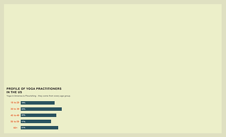
I see a horizontal bar charts. The first thing I see is the bars, then I go to the age labels. The title says "profile of yoga practitioners in the US", I notice they are more equal to each other, which is a bit surprising and very interesting to learn. The spread of yoga practitioner around age groups are more evenly than I think.
I prefer the current one, I think it make sense to get rid of the grid lines and the labels at the bottom is very helpful. The second one is definitely cleaner.
For the visual language model, you emulated the model closely, you got the labels align with the bars. Your range labels and the percentage labels have different colors. You got same orange and dark green from your color model. You used the sans serif font to your titles, seems to be a good match.
I can see your display will fit perfectly in the bottom left corner.
Response to first critique
The critic gave all positive feedback for my revised bar chart, so I kept it the same for my final revision. To make the section more dynamic and include more helpful information, I added pie charts to show the gender distribution on top of the age distribution for yoga practitioners in the US.
Emily Qiao
I see the capitalized title with small descriptive text. I can see there's different age group of yoga practitioners. I'm surprised to see that each age range distributes pretty evenly.
I prefer the revised version, adding the orange adds dynamics to your display, and the colors are a better match with your color model and visual language model.
Your display has the same the percentage numbers on the left side of the bars as your model. And the large age labels are the same as the "age factor" bar charts in your model. Your are following the same orange and dark green from your color model.
Your choice of font style matches the bolded sans serif font for the subheadings and had the same style for the annotations.
I think your display will work well in the bottom left corner of your display.
Response to second critique
Emily also have no criticism for my bar chart and think it is "perfect" given my visual language model and color model. So I kept it the same for my final revision. To make the section more interesting and include more helpful information, I added pie charts to show the gender distribution on top of the age distribution for yoga practitioners in the US. With 2 types of charts, my number displays are more informational.
Julie Zhu
I see a bar chart showing me the age distribution of how many people are practicing yoga in each age group. I can see that the number of yogis for different age ranges actually are pretty close to each other. I find it very interesting that the
I definitely prefer the revised version, since this version looks much cleaner now that you got rid of the grid lines and x-axis labels. I like your changed the age range labels into orange, which makes the display more interesting and matches your visual language and color model better.
I see that you emulated the orange, blue-greenish color, brown, and red color from your color model. I see that you've emulated the typography and visual language in terms of rectangles and circles. Your revised display has the y-axis labels with bright colors and is aligned in the center, which is a great match with the bar chart in your visual language model. The only thing I would like to point out is that having just the bar chart can a bit boring and less visually appealing. So you may want to consider adding some other number displays such as pie charts to make the whole section more visually appealing and convey more information.
Response to third critique
Julie pointed out that having just the bar chart for the entire section for my number display can be a bit boring and lack of visual impact. I totally agree and added 2 donut charts that follows the flat design style from my visual language model. Having the pie charts not only made the section more visually appealing, but allows me to convey more information as well.

For the revised display, I used different length of rectangular bars to encode the percentage of yoga practitioners. I used position (from top to bottom) to encode age ranges as it gets older.
With the 2 charts, I like to show the profiles of American yogis - what population practice yoga, in terms of age and gender? I am hoping the viewer will learn that yoga is a popular sport in the US and good for all ages, through this, I am hoping to get more people to be interested in yoga and trying it out.
I emulated my bar charts from the bar chart display on my visual language model, so the labels have the same bright colors, with percentages on the left end of the bars. For the donut charts, I followed the same format with thick belt presenting the wedge and the number inside the circle from the pie chart in the model as well.
I used the same orange and dark green colors from my model for both of my bar chart and donut chart.
I used large bolded font for the subheading and small thin font for the body, which are the same font styles used in my text model. For the annotations in the chart, I stick to bolded text that matches the y-axis labels and the percentage labels from the charts in my text model. Same goes for my pie charts.
I decide to put my display in the bottom left corner of my layout model.